✅ CSS Flexbox – A Beginner-Friendly Guide
CSS Flexbox (or Flexible Box Layout) is a powerful layout model in CSS3 that helps web developers design responsive and space-efficient layouts with ease. Whether you're building a navigation bar, image gallery, or a dynamic web component, Flexbox makes it simpler to align and distribute content inside a container.
📌 What is Flexbox in CSS?
Flexbox is a one-dimensional layout system that arranges items in rows or columns. It helps manage space distribution between elements and aligns them perfectly, regardless of screen size or device type.
To start using Flexbox, define a container with:
display: flex;🧱 Key Concepts of Flexbox
Flexbox is based on two main components:
- Flex Container – The parent element with
display: flex; - Flex Items – The child elements inside the container
🔧 Essential Flexbox Properties
Here are the most commonly used Flexbox properties:
1. flex-direction
Controls the direction of flex items:
flex-direction: row; /*Default*/
flex-direction: row-reverse;
flex-direction: column;
flex-direction: column-reverse;
2. justify-content
Aligns items along the main axis (horizontally by default):
justify-content: flex-start; /*Default*/
justify-content: flex-end;
justify-content: center;
justify-content: space-between;
justify-content: space-around;
justify-content: space-evenly;
3. align-items
Aligns items along the cross axis (vertically by default):
align-items: stretch;    /* Default */
align-items: flex-start;
align-items: flex-end;
align-items: center;
align-items: baseline;
4. flex-wrap
Allows items to wrap to the next line if needed:
flex-wrap: nowrap;       /* Default */
flex-wrap: wrap;
flex-wrap: wrap-reverse;
5. align-self
Allows individual items to override align-items:
align-self: auto;
align-self: flex-start;
align-self: flex-end;
align-self: center;
align-self: baseline;
align-self: stretch;
6. flex-grow, flex-shrink, flex-basis
Control how items grow, shrink, or define their initial size:
flex-grow: 1;
/* Item will grow to fill space */
flex-shrink: 1;
/* Item will shrink if needed */
flex-basis: 100px;
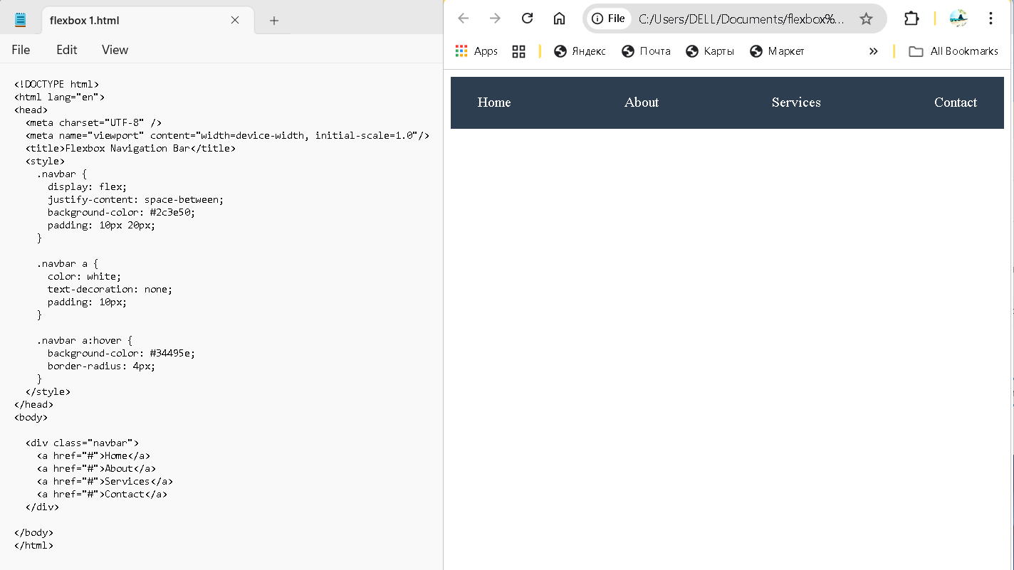
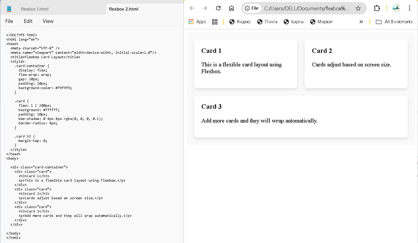
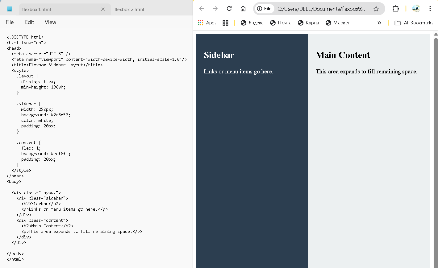
/* Base size before grow/shrink */📦 Example: Flexbox Layout
🎯 Why Use Flexbox?
- ✅ Easy to align items both vertically and horizontally
- ✅ Ideal for responsive design
- ✅ Reduces need for complex float or positioning hacks
- ✅ Works well with dynamic or unknown item sizes
❗ Common Flexbox Mistakes
- Forgetting
display: flex;on the parent container - Confusing
justify-contentandalign-items - Overusing Flexbox where CSS Grid might be better (for 2D layouts)
🧭 Learn Flexbox (CSS Layout)
CSS Flexbox is a powerful layout system for aligning and distributing space within containers. It's especially useful for responsive designs.
These tutorials cover everything from basic alignment to advanced layout techniques with Flexbox.